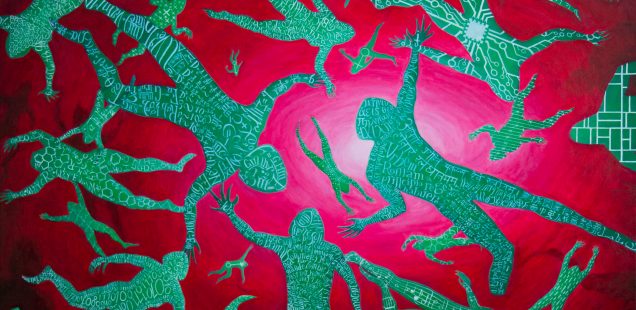
Oil on canvas, 40” x 30” (102 x 76 cm), 2020 This painting was inspired and dedicated to the great Tom Pynchon (may you sail well, dear Big Man, wherever you are; this work will be the link…
Karlheinz Stockhausen advised his students to avoid any repetition while creating music. On the other hand, Hans Jaki Liebezeit the drummer of the famous German krautrock band Can (who were students and followers of Stockhausen) had completely opposite…
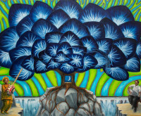
Oil painting on canvas, 30” x 24”, August 2017 This is my first painting after more than a year and a half of time spent with other things. The long inactivity made me nervous and with a feeling of…

Oil painting on canvas, dimensions 40″ x 30” (102 x 76 cm), 2015 It was in the late 60’s when I first heard of Buffy. I lived in Europe then; the world was much bigger than it’s now and the…

“Great Gate of Kiev”, oil on canvas, 24” x 30” (61 cm x 76 cm) Together with “Baba Yaga” this painting is an illustration for a movement of the famous “Pictures at an Exhibition” (composed by Modest Musorgsky after…
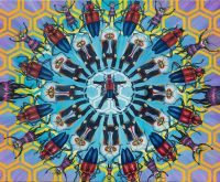
Oil painting on canvas, 24″ x 30″ (60 cm x 76 cm), November 2014 A friend of mine called and asked me to participate in a project she already was part of. The idea was to have four or…
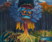
Oil painting on canvas, dimensions 40″ x 30” (102 x 76 cm), 2013. Off the Mediterranean themes to a dream where the reality and the fantastic are even more accentuated: two men in a dream dreaming about the reality that…


Recent Comments